
Most people choose a paint colour first and build from there. I do it the other way round. Here is why starting with materials — linen, stone, timber, rattan — leads to spaces that feel more considered, more cohesive, and more timeless.
There is a moment in almost every first consultation that goes like this. The client pulls out their phone, opens Pinterest, and shows me a colour. "I want this kind of sage green," they say, or "I love this dusty pink." And I always respond the same way: "That is beautiful. But let us not start there."
It is not that colour does not matter. It does. But in my experience, colour is the easy part. It is the thing that catches your eye in a photograph. The thing you notice first and describe most easily. What is harder to articulate — and far more important — is how a space feels. And feeling comes from materials, not from colour.
Close your eyes and touch
I learned this in France, where interior design education is deeply tactile. We were taught to close our eyes and touch everything. The weight of a curtain fabric between your fingers. The grain of a timber sample against your palm. The coolness of marble versus the warmth of limestone. The difference between a raw linen and a washed one — both cream, both natural, but completely different in how they feel and how they catch the light.
When you close your eyes, colour disappears. What remains is texture, weight, temperature, sound. Does the fabric feel substantial or fragile? Does the stone feel warm or cold? Does the timber feel rough or smooth? These qualities are what your body registers when you walk into a room — before your eyes have even adjusted, before you have consciously noticed anything, your nervous system is already reading the materials around you.
A room made of warm, natural, textured materials feels welcoming even before you look at it. A room made of cold, smooth, synthetic materials feels uncomfortable even if the colours are perfect. This is why I start with materials. They are the foundation of how a space feels.
"When you close your eyes, colour disappears. What remains is texture, weight, temperature. That is what your body reads first."
The problem with starting with colour
When you choose a paint colour first, everything else becomes subordinate to it. You pick a sofa that "matches" the wall. You find a rug that "goes with" the cushions. You choose a lamp because it is the right shade. The result is a room that is colour-coordinated — which sounds like a good thing — but that often feels flat, lifeless, and strangely one-dimensional.
That is because colour coordination, by itself, does not create depth. A room painted in beautiful sage green with a sage cushion, a sage throw, and a sage-toned rug is not a considered room. It is a room that has been colour-matched. There is no tension, no surprise, no play between different elements. Your eye has nothing to explore because everything is saying the same thing.
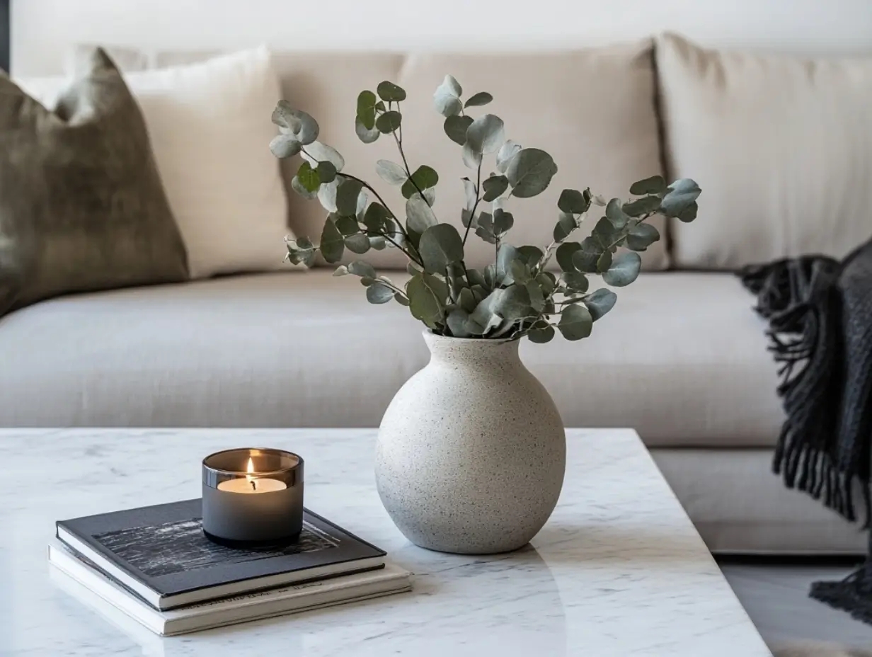
Materials create the depth that colour alone cannot. A rough-sawn timber shelf next to a smooth plaster wall. A chunky wool throw on a sleek linen sofa. A glazed ceramic vase on a raw stone surface. These contrasts — rough and smooth, matte and shiny, heavy and light — give a room its visual richness. They are what make you want to keep looking, keep touching, keep discovering.

The interplay between rough timber, soft linen, and smooth stone creates a depth that colour coordination alone can never achieve.
My process: materials first
When I start a project, the first thing I do is build a materials palette. Not a colour palette — a materials palette. I gather physical samples of the key materials I want to use in the space. Timber offcuts. Stone samples. Fabric swatches. Tile chips. I lay them out on a table together and see how they talk to each other.
This is a physical process. I cannot do it on a screen. The samples need to be real because I need to see how they interact with actual light — how the timber grain catches the afternoon sun, how the stone changes colour when it is wet, how the linen drapes and creases. These are things that a photograph simply cannot tell you.
Once the materials are right — once they feel cohesive and balanced, once there is enough contrast to be interesting but enough harmony to be calm — then I think about colour. And almost always, the colours suggest themselves. The warm honey of the timber leads to a warm white on the walls. The grey-green of the stone leads to a muted sage on the upholstery. The palette emerges from the materials naturally, rather than being imposed from above.
.webp)
Materials age
Here is the other reason I prioritise materials: they change over time. And how they change matters enormously. A paint colour fades evenly and boringly — it just gets duller. But materials age in interesting, beautiful, characterful ways.
Timber develops a patina. Brass oxidises and darkens. Leather softens and creases. Linen relaxes and becomes more supple. Stone wears smooth where feet walk and hands rest. These are not defects — they are the room writing its own history. A space built on good materials becomes more beautiful with time, not less.
Cheap materials do the opposite. Laminate chips. Synthetic fabric pills. Veneer peels. Cheap stone stains. These materials look their best on day one and deteriorate from there. Choosing real, honest materials is not about luxury or snobbery. It is about choosing things that will reward you over years, not just weeks.
"A space built on good materials becomes more beautiful with time. That is the opposite of what happens with colour alone."

The materials I keep reaching for
Every designer has their recurring cast of characters — the materials they return to project after project because they simply work. Mine are shaped by both my French training and the Australian context I now design in.
Linen is my constant. I use it everywhere — curtains, upholstery, bedding, table runners. It has a quality that no other fabric can replicate: it is simultaneously relaxed and refined. It wrinkles, and the wrinkles are part of its beauty. It softens with every wash. It comes in a thousand shades of cream and white and sand, each subtly different. And it works with the Northern Beaches light like nothing else — catching it, filtering it, glowing with it.
Timber is next. Specifically Australian hardwoods — spotted gum, blackbutt, tallowwood. These timbers have a warmth and character that imported species rarely match. They are hard enough for floors and benchtops, beautiful enough for furniture, and they develop extraordinary patinas over time. I often pair them with lighter, cooler-toned stones to create contrast.
Then there is stone. I prefer honed finishes over polished — they are more forgiving, more tactile, more honest. Limestone, travertine, sandstone. These are materials that connect a home to the earth it sits on, especially here on the Northern Beaches where sandstone is literally the ground beneath your feet.
And finally, the accent materials: rattan, ceramic, brass, wool. These are the materials that add personality and specificity. A handmade ceramic bowl. A brass door handle that darkens with touch. A rattan chair that brings lightness to a heavy room. These are the details that make a space feel curated rather than decorated.
Where colour comes in
I do not want to give the impression that I ignore colour. I do not. Colour is powerful, emotional, and important. But it is most powerful when it emerges from a strong material foundation rather than leading the way.
In practice, this means that most of my colour decisions are soft and restrained — warm whites, sandy neutrals, muted greens, soft greys. These are the colours that natural materials suggest. Occasionally I will introduce a stronger colour — a deep terracotta, a forest green, a warm ochre — but always as an accent, and always because the materials have created a foundation strong enough to support it.
If you take nothing else from this article, take this: next time you are tempted to start with a paint swatch, put it down. Go to a stone yard instead. Pick up a piece of limestone. Feel its weight in your hand. Hold it up to the light. Then find a timber that speaks to it, a fabric that softens it, a metal that sharpens it. Build your room from there, and the colour will find itself.
Design tips
Materials
Process
Design philosophy


.png)