
Sand, salt, eucalyptus, light. The Northern Beaches has one of the most distinctive visual landscapes in the world. Here is how to bring it inside — without going full nautical.
I need to say something upfront: this is not an article about anchors, rope, or navy stripes. The moment you hang a wooden sign that says "BEACH" in your hallway, something goes wrong. The coastal aesthetic becomes a costume — a theme park version of a life that is actually happening right outside your window.
What I want to talk about instead is something quieter and, I think, much more interesting. The Northern Beaches has a specific quality of light, a specific colour palette, and a specific mood. When you pay attention to those things — really pay attention — you can create interiors that feel deeply connected to where you live, without a single seashell in sight.
Start with the light
The first thing I noticed when I moved to the Northern Beaches from France was the light. It is completely different from anything I had experienced in Europe. It is sharper, brighter, more direct. In the morning it comes in warm and golden. By midday it is almost white — intense and unforgiving. In the late afternoon it softens again, turning everything slightly amber.
This matters enormously for interiors. A colour that looks perfect at nine in the morning can look completely wrong at noon. A wall painted in cool white will feel beautiful in a Parisian apartment where the light is soft and grey. Here, that same cool white can feel harsh, almost clinical, under the midday sun.
The Northern Beaches palette starts with warm whites. Not cream, not yellow — just white with a subtle warmth underneath. Think of the colour of dry sand in shade, or the inside of a shell. These are whites that absorb the intense light instead of bouncing it back at you.
"The light here is extraordinary — but it demands a different palette than what works in Europe or even in southern Sydney."
The colours that are already here
The best way to find your palette is to step outside and look. Not at the ocean — everyone looks at the ocean. Look at the ground. Look at the headlands. Look at the bark of a spotted gum. Look at the sandstone cliffs at Narrabeen or the dried grasses along the coastal walk at Long Reef.
What you will find is a palette that is surprisingly warm and earthy. Soft sand. Pale terracotta. Silvered timber. Warm grey-green from the eucalyptus. Charcoal from wet rock. Rust from the iron in the sandstone. These are not the bright blues and whites of a Greek island — they are muted, layered, grounded.
When I work on a Northern Beaches project, these are the colours I reach for. Not because I am trying to "match the landscape" in some literal way, but because these are the tones your eye is already calibrated to. When you come in from a walk along Freshwater Beach and your living room echoes those same warm, sandy, silvered tones — it just feels right. There is no dissonance between outside and inside.
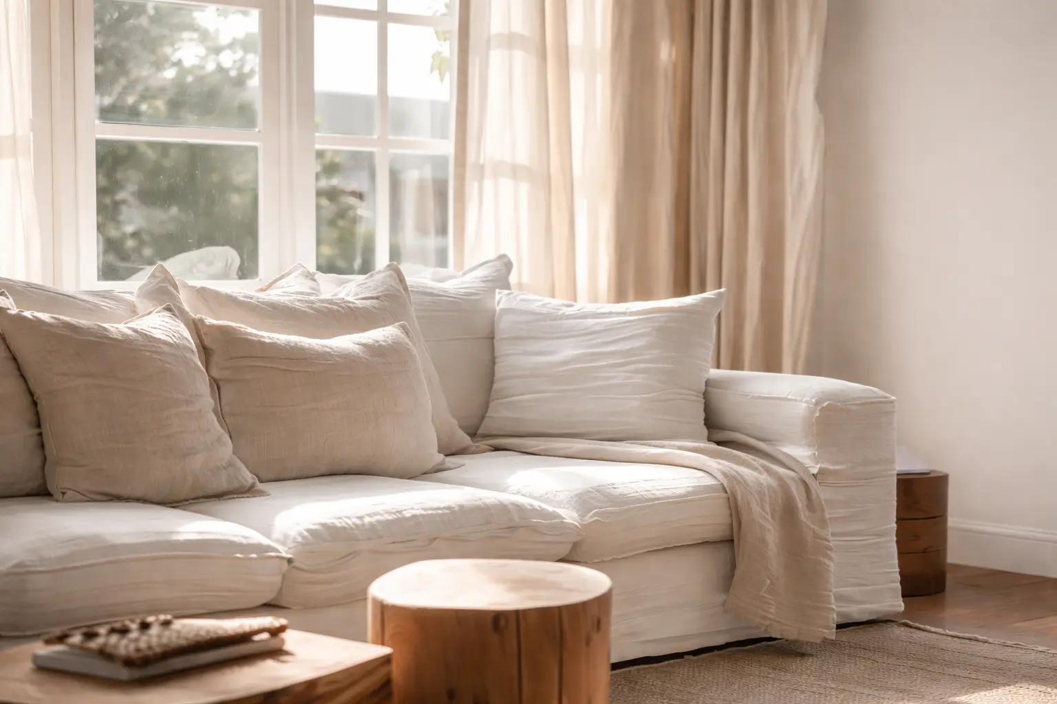
Warm whites, natural timber, and sandy tones — colours borrowed from the landscape, not from a coastal theme.
Materials that belong here
Colour is only half the story. On the Northern Beaches, materiality matters just as much — maybe more. This is a place where you walk in from the beach with sand on your feet. Where windows are open half the year. Where salt air touches everything. The materials in your home need to work with that reality, not against it.
I gravitate towards materials that age well in this climate. Timber that develops a patina rather than deteriorating. Natural stone that handles moisture. Linen that gets softer with every wash. Ceramic and terracotta that can take a knock. These are materials with integrity — they do not pretend to be something they are not, and they look better with time rather than worse.
There is a practical dimension too. Polished marble looks stunning in a city apartment, but on the Northern Beaches it will show every grain of sand and every water mark. A honed limestone, on the other hand, hides imperfections and develops character. Choosing the right material is not just about aesthetics — it is about choosing something that suits how you actually live.
The indoor-outdoor question
Everyone talks about indoor-outdoor living on the Northern Beaches, and for good reason — it is central to how homes function here. But the mistake I see most often is treating the transition as purely architectural. Bi-fold doors, decking, maybe an outdoor kitchen. The structure is there, but the visual connection is not.
The palette should flow. If your outdoor area is all warm timber and greenery and sandstone, and then you step inside to a grey-and-white interior with chrome fixtures — the transition jars. It feels like walking from one space into a completely different one. The best Northern Beaches interiors blur that line. The same warm tones continue from the deck into the living room. The timber outside echoes the timber inside. The plants on your balcony are reflected in the natural textures of your interior.
"The best Northern Beaches interiors do not stop at the door. The palette flows from outside in — and back again."

What to avoid
I mentioned the nautical cliché at the start, but there are subtler traps too. The all-white interior is one. It photographs beautifully, and on a sunny Northern Beaches day it can feel temporarily spectacular — but it also washes out in the harsh midday light, shows every mark from daily life, and ultimately feels cold. White needs warmth around it to work here: warm timber, textured linen, a sandy rug, something to ground it.
Another trap is the Hamptons look. I understand the appeal — it is polished, it feels beachy, and it is everywhere in interiors media. But the Hamptons is a very specific place with a very specific climate and light. It is not the Northern Beaches. The colours are cooler, the palette is bluer, and the overall feeling is more formal. It can look beautiful in a magazine, but in an actual Northern Beaches home — with the harsh summer sun and the relaxed outdoor lifestyle — it often feels slightly out of place. Like wearing a blazer to the beach.
Finding your own version
The Northern Beaches palette is not a rigid set of rules. It is a starting point — a set of principles grounded in the specific light, landscape, and lifestyle of this stretch of coast. Within that framework, there is enormous room for personality. Some of my favourite projects here have included pops of ochre, deep forest green, or warm terracotta. The key is that those colours feel connected to the landscape rather than imported from somewhere else.
My advice is simple: before you choose a single colour or material for your home, spend a week really looking at the world around you. Walk the coastal path. Notice what happens to the light at different times of day. Pay attention to the textures and colours that make you feel calm, grounded, connected. Then bring those things inside.
That is the Northern Beaches palette. Not a set of paint swatches — a way of seeing.
Sydney living
Colour palette
Materials
Northern Beaches



.png)